Out-of-home advertising turns everyday spaces into storytelling platforms. From towering billboards and transit posters to eye-catching installations, outdoor ads capture attention in the real world—where people live, move, and make decisions. In this post, we’ll explore award-winning out of home campaigns, breaking down how they creatively use space, visuals, and messaging to connect with audiences on the go. Let’s dive into how the streets, walls, and sky become canvases for bold marketing and lasting impressions.
- “Without Teachers” – Adams + Fairway 2017 (https://aef.com/ad-campaigns/without-teachers/)
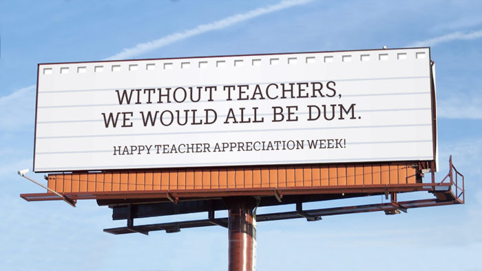
Description: This out-of-home ad is a large billboard designed to resemble a sheet of classic lined notebook paper. The deliberate misspelling of “dumb” as “dum” immediately grabs attention and cleverly emphasizes the importance of teachers in helping us learn—even how to spell. Beneath the main line, a warm and appreciative message reads: “Happy Teacher Appreciation Week!” This ad’s simplicity and visual familiarity evokes nostalgia and drives home the campaign’s message through irony and gentle humor.
Objective: This out of home ad aims to honor and uplift educators during Teacher Appreciation Week by highlighting just how vital their role is in our development. Instead of taking a traditional thank-you route, this ad uses humor and an intentional error to illustrate what life might look like without teachers. The goal is to generate public recognition and stronger appreciation for teachers.
Target Market: This ad targets the general public—students, parents, educators, and community members—essentially anyone who has ever benefited from a teacher’s guidance. It appeals especially to people who may overlook the daily contributions of teachers, reminding them through a playful, relatable concept. By placing this message on a highly visible billboard, this out of home ad ensures maximum reach and emotional impact, especially during a week dedicated to teacher gratitude.
Call to Action: The billboard acts as a social prompt. The misspelling is designed to spark reflection and conversation—encouraging viewers to recognize how much we owe to educators. It also serves as an invitation to act and show more support for our beloved teachers.
Value Proposition: This out of home ad distills a big truth into one small, intentional “mistake.” It shows that without teachers, even the basics—like spelling—fall apart. The clever wordplay makes the message memorable and emotionally effective. It reminds the public that teachers are not just part of the system—they’re the foundation of learning. By invoking both humor and gratitude, the campaign positions teachers as heroes who help shape the minds of every generation.
2. “Feel the Burn?” – AIDS Healthcare Foundation 2017 (https://aef.com/ad-campaigns/feel-the-burn/)
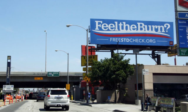
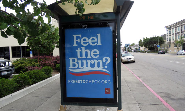
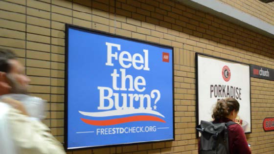
Description: This bold and minimalist out-of-home ad features a solid blue background with the phrase: “FeeltheBurn?” Right below it, is the URL: FreeSTDcheck.org. The design is simple—no images, no clutter—just attention-grabbing text with an urgent question that doubles as a warning. The phrase references one of the symptoms commonly associated with sexually transmitted diseases (STDs), such as burning during urination. This out of home ad campaign includes three formats: a large highway billboard visible to drivers, a bus stop bench ad, ensuring visibility in high foot-traffic areas, and a transit poster on a wall, targeting public transportation users directly.
Objective: This out of home campaign’s main objective is to promote STD awareness and testing by using provocative language and public visibility to spark curiosity, concern, and ultimately action. The ambiguous phrase “feel the burn?” is designed to make people do a double take and reframe their assumptions. The ad confronts the viewer with a possible health risk—then immediately offers a resource to take action: FreeSTDcheck.org. The goal is to destigmatize STD testing and make it feel accessible and important.
Target Market: This ad is aimed at sexually active individuals, especially young adults, teens, and those in urban areas who regularly encounter public advertising on commutes or during daily routines. The use of informal language makes it also appealing to underserved populations who may not regularly visit doctors for routine sexual health screenings or be as knowledgeable about symptoms. The placement of the ads in public transportation zones and on roadways also ensures high visibility among people who may not otherwise engage with digital health campaigns.
Call to Action: The call to action is both direct and subtle. Rather than saying “Get tested!” straight up-front, the ad poses a relatable question and subtly provides a solution: FreeSTDcheck.org. The site URL serves as both the resource and the nudge to act. It invites the viewer to self-reflect and follow up with an easy, private step toward sexual health. This out of home ad’s simplicity and lack of shame-inducing imagery makes it feel more like a public service resource to help people stay healthy.
Value Proposition: This out of home ad stands out because it blends a provocative question with public health messaging, delivering awareness with minimalism and cleverness. Its value lies in its ability to normalize the conversation around STDs and drive people to an accessible and potentially life-saving solution. This ad manages to do all of this with just two lines of text and a simple design. Ultimately, it positions STD testing as normal, responsible, and nothing to be embarrassed about, breaking down stigma through strategic visibility.
3. “One Tasty View” – Moroch and Sly Fox 2017 (https://aef.com/ad-campaigns/one-tasty-view/)
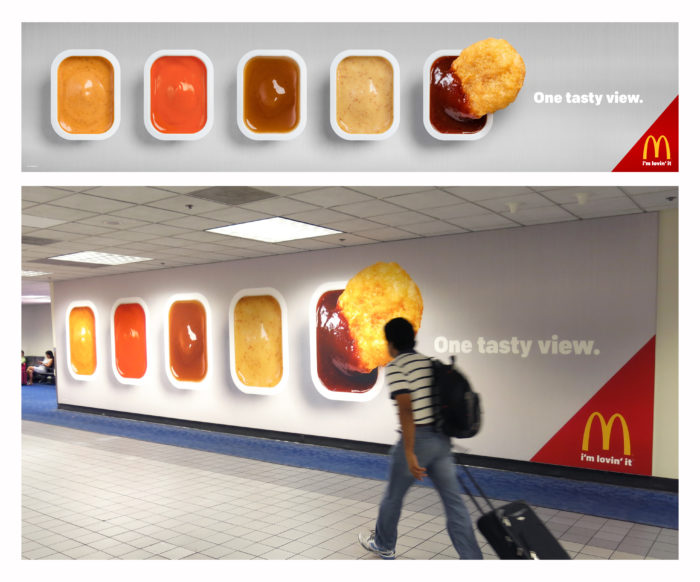
Description: This out of home ad is a large transit poster that shows five McDonald’s dipping sauces lined up against a white background. In the first sauce container of barbecue sauce, a single Chicken McNugget is being dipped in. Beside the sauces, it says “one tasty view” in simple text. The layout is clean, minimal, and eye-catching, especially in a busy setting like an airport or transit terminal.
Objective: The main objective of this out of home ad is to make people think about McDonald’s food—specifically nuggets and sauces—in a fun and appealing way. Instead of showing a full meal or using traditional slogans, it uses a familiar image to create a craving. The placement in an airport or transit terminal further emphasizes the idea that McDonald’s is travel-friendly, comforting, and accessible—even when you’re on the go.
Target Market: This ad speaks to travelers, commuters, and everyday McDonald’s fans. It’s designed to catch the attention of people passing through public spaces who might be hungry or looking for something familiar and easy. The simplicity of the image works for all ages and backgrounds.
Call to Action: The image of the McDonald’s chicken nugget dipping into sauce makes you think about the food and maybe want to stop for some. Moreover, the phrase “one tasty view” adds a playful twist, making you see food as something worth looking at—and eating.
Value Proposition: This out of home ad shows that McDonald’s is more than just fast food—it’s something comforting and satisfying. The nugget and sauce are small, simple things, but they remind people of what they enjoy about McDonald’s. It makes the brand feel familiar, fun, and easy to enjoy at any time.
4. “Unlimited Greatness – Serena” – Wieden+Kennedy 2017 (https://aef.com/ad-campaigns/unlimited-greatness-serena/)

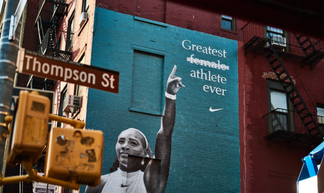
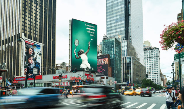
Description: These out of home ads feature powerful images of Serena Williams. Beside her, bold white text reads “Greatest female athlete ever,” but the word “female” is crossed out. Only “Greatest athlete ever” remains visible. In the corner, the Nike swoosh logo is placed, keeping the branding minimal yet recognizable.
Objective: This out of home ad’s purpose is to challenge outdated thinking and highlight Serena’s accomplishments not just as a woman, but as an all-time great, period. By crossing out the word “female,” Nike pushes the idea that greatness has no gender qualifier. It’s a celebration of Serena’s impact and a broader message of breaking barriers in sports and beyond. She is presented as the true GOAT.
Target Market: This ad speaks to sports fans, athletes, and especially young people who look up to Serena as a role model. It also targets anyone who values empowerment, equality, and breaking limits. The message goes beyond tennis—it appeals to those who believe in challenging social norms and redefining what greatness looks like.
Call to Action: The crossed-out word itself serves as a bold statement. It invites viewers to think differently, to question how we talk about achievement, and to support athletes who rewrite the rules. It motivates people to see potential without limits.
Value Proposition: Nike reinforces its brand as one that stands for empowerment, equality, and bold messaging. This out of home ad positions Nike not just as a sports brand, but as a leader in cultural conversations. By spotlighting Serena in this way, Nike aligns itself with greatness that inspires beyond the game.
5. “Apple iPhone6” – TBWA\ Media Arts Lab 2017 (https://aef.com/ad-campaigns/apple-iphone6/)
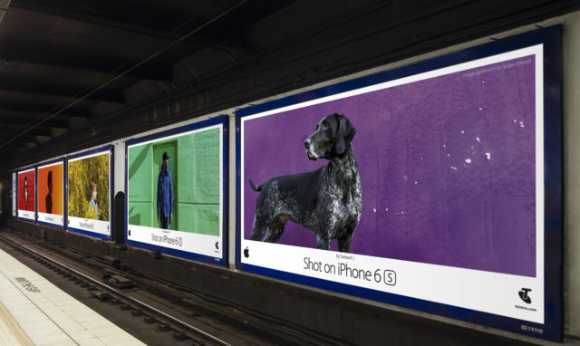


Description: This out of home ad campaign features a series of large, eye-catching billboards and posters in public places like malls and train stations. Each one displays a beautiful, high-quality photograph— one of a dog, a young girl surrounded by flowers, or scenic landscapes. The photos are simple yet striking. On the one with the dog, the text “Shot on iPhone 6s” is included, serving as a subtle reminder that these professional-looking images were taken using just a iPhone camera.
Objective: The main objective of this out of home ad campaign is to showcase the impressive camera capabilities of the new iPhone 6s. By using real images taken by everyday users, Apple aims to highlight the phone’s potential for creativity, quality, and ease of use. The idea is to let the product speak for itself through real-world results, rather than technical jargon or flashy features.
Target Market: The ad is aimed at current and potential smartphone users who value photography and want to capture meaningful moments in high quality. It appeals to creatives, social media users, and everyday people who want great camera quality without needing professional equipment. It’s also directed at brand-loyal Apple customers and those thinking about upgrading their current device.
Call to Action: The message is clear: if you want to take photos this good, you can—with the new iPhone 6s. The ad invites viewers to imagine the possibilities of what they could capture with just their iPhone. It encourages people to see their own world as photo-worthy and to trust the iPhone to capture great photos with high quality.
Value Proposition: Apple positions the new iPhone 6s not just as a phone, but as a powerful creative tool. This out of home ad campaign emphasizes the accessibility of high-quality photography and makes the point that beauty and quality are within reach. It reinforces Apple’s identity as a brand that blends innovation with simplicity and connects with people’s lives in meaningful ways.
Great outdoor ads don’t wait for attention—they demand it. By transforming everyday environments into creative stages, these campaigns prove the power of visibility, simplicity, and bold storytelling in public spaces. Whether you’re a curious viewer or an aspiring marketer, out of home advertising shows us how creativity can live beyond the screen and influence people right where they are. Thanks for exploring with us here on EmpowerMe Life—what’s the most unforgettable billboard or outdoor ad you’ve ever seen?

Hi Aamiya,
I really loved your analysis of this campaign—it was such a smart and heartfelt ad, and you captured its impact really well. The way you pointed out the use of irony and gentle humor to communicate such a sincere message was spot-on. I also appreciated how you described the visual familiarity of the notebook paper; it adds that nostalgic touch that makes the message feel even more personal and relatable.
Your breakdown of the call to action was especially strong—it’s true, that intentional misspelling does a lot more than just grab attention; it actually makes people stop and think about how much we’ve learned thanks to teachers. It’s a clever, creative way to spark both appreciation and conversation.
One thing I was wondering as I read your take: Do you think this kind of playful approach would work year-round, or does it rely on the context of Teacher Appreciation Week to really land? And how do you think this ad compares to more traditional thank-you messages in terms of lasting impact?
Really thoughtful work—you made me appreciate the concept even more!
LikeLike
Hey Freddy!
Thank you so much for your kind words! I’m really glad the points about irony and nostalgia resonated with you—I think that combination of playfulness and sincerity is what made the ad so memorable. You bring up a great question about whether the message works year-round. I think the emotional core of it—gratitude for teachers—is definitely timeless, but the playful tone and visual cues (like the notebook paper and misspelling) feel especially impactful during Teacher Appreciation Week when people are already reflecting on their educational journeys. Compared to more traditional thank-you messages, I’d say this one stands out more because it invites engagement and emotion in such a subtle yet creative way. It sparks a smile, but also makes you pause and reflect. Thanks again for such a thoughtful response—it really made me think more deeply about the ad too!
LikeLike
Hi Aamyia! I agree that the “Feel the Burn?” billboards are clever and impactful PSAs. I like how it uses humor and wordplay to grab attention while directing individuals to important services that can help them through what’s often a very sensitive and uncomfortable situation. It is smart because people can see the ad, process it in their own time, and then seek out testing or resources from the privacy of their own home when they are ready.
These kinds of billboards significantly increase awareness and accessibility to STD services, which is so important for public health. My only question is how you strategically place these billboards without upsetting certain parts of the community. Do you focus on college campuses, 50+ and retirement communities, or urban areas that have high STD transmission rates? How do you advertise these services to the groups most likely to need them while still being mindful of public perception? I’d love to hear your thoughts on that strategy side of it!
LikeLike
Hey Samantha!
Thank you so much for your response! I completely agree—this campaign does a great job balancing humor and sensitivity, which is so key when addressing topics like STDs. The privacy aspect you mentioned is something I really appreciated too—giving people the space to take action on their own terms is powerful.
Your question about strategic placement is such an important one. I think targeting high-impact areas like college campuses and urban neighborhoods with higher transmission rates makes a lot of sense from a public health perspective. At the same time, community values and norms definitely need to be considered. One way to approach that might be using different messaging styles in different areas—still clear and effective, but maybe more subtle in communities that may be more sensitive to direct messaging. And pairing the billboards with online ads or QR codes could also let people explore resources privately, even if they feel hesitant engaging publicly.
Thanks again for engaging!
LikeLike
Aamiya,
1. Describing the Ad and Its Appeal:I think you were able to delineate the depiction of this ad quite well. The classic lined notebook paper certainly ensure people understand the premise of the statement, “WITHOUT TEACHERS, WE WOULD ALL BE DUM,” and where it’s coming from. It was wise to improperly spell the word dumb, to further drive home the point, teachers are needed! The humor derived from the conspicuous misspelling significantly enhances the ad’s appeal by making it engage, memorable, and thought-provoking.
2. Objectives of the Ad Campaign: I couldn’t have described the objective of this ad any better than you, even if I tried. The primary objective of this outdoor advertisement is to honor and uplift educators during Teacher Appreciation Week by powerfully illustrating the vital role they play in our intellectual development. Instead of employing a conventional expression of gratitude, the ad strategically utilizes irony and a deliberate error to highlight a potential consequence of lacking teachers.
3. Target Market: You’ve done a great job outlining the intended target of this ad; it’s certainly broad! It’s reaching everyone, as every person has interacted with a teacher in some fashion. I think one thing to note here is that the use of a highly visible billboard ensures maximum reach within the community, strategically capitalizing on a designated week for acknowledging teachers to amplify the emotional resonance of the message, tapping into the shared experience of learning and potentially recalling personal instances of similar spelling errors.
4. Call to Action: I’d agree with your analysis; it causes time to reflect on the impacts of teachers. The explicit “Happy Teacher Appreciation Week!” serves as an implicit call to action, encouraging individuals to actively express their gratitude and offer support to teachers in their own communities during this designated time of recognition.
5. Value Proposition: The simple message implies such a large statement, and I think you’ve captured that in your review. I agree with you, the intentional misspelling serves as a potent illustration, demonstrating that even fundamental skills like accurate spelling are a direct result of the education and guidance provided by teachers. The clever wordplay ensures the message resonates and remains in the viewer’s mind, effectively emphasizing that teachers are not merely facilitators within an educational system but are, in fact, the very foundation upon which learning is built.
LikeLike
Hey Adam!
Wow—thank you so much for such a thorough and thoughtful response! I truly appreciate how you broke everything down so clearly. I love that you emphasized how the humor and wordplay make the ad not only engaging but also deeply impactful. You’re so right—the simplicity of the message carries so much weight, and it’s amazing how something as small as a misspelled word can prompt such meaningful reflection on the value of teachers.
I also really liked your point about the shared experience of learning and how that broadens the target audience. Everyone has that one teacher (or a few!) who made a lasting impact, and this ad taps into that collective memory in such a clever way. It’s encouraging to see how creative messaging can be both funny and powerful at the same time.
Thank you again for your encouraging feedback and engagement!
LikeLike